 This is my final poster design. The purpose of this poster is mainly to show how the media can be useful. In this case I used World War III stories as an example. The two types of media I used for my poster are novels and videogames. I included quotes from each story along with either an illustration or photograph that further emphasizes the quote. America, Europe, and Russia are in the background because they are the three main nations in all three stories. The oil = war concept is in the center of the poster because oil is what starts the war in all of these stories.
Wednesday, November 19, 2008
Project 3 poster
This is my final poster design. The purpose of this poster is mainly to show how the media can be useful. In this case I used World War III stories as an example. The two types of media I used for my poster are novels and videogames. I included quotes from each story along with either an illustration or photograph that further emphasizes the quote. America, Europe, and Russia are in the background because they are the three main nations in all three stories. The oil = war concept is in the center of the poster because oil is what starts the war in all of these stories.


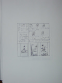
Project 3 large poster thumbnails


I made my second round poster thumbnails this large because I wanted to create a poster with many small features rather than one with a few large features. So in order to create thumbnails that can help me with this concept, obviously, the bigger the better.

Project 3 logo
 This is the logo design that I used for my poster. However, I did not include the border in the final design.
Project 3 logo thumbnails
 The name of my fictional company is MAW (Media's Accurate Warning). I used four images representing different types of media. The first is novels, the second movies, third television, and fourth videogames.
Monday, October 27, 2008
Description
Mark Pasquino, Project 2
Photoshop, 10/27/08
My stamp design is based on the Western Broome Veterans Memorial and Wall of Heroes located in Endicott across the street from the Union Endicott High School. I used the International Typographic Style for my main design style, which is very evident on the upper right corner of the stamp with the military emblems. I used a grain texture for most of the stamp design because it had the appearance of an actual stamp without taking away the visibility of the images. The three images on the bottom of the stamp are paintings of World War II, the Korean War, and the Vietnam War. The image at the top left of the stamp is the memorial sign located at the front of the monument. The five images at the top left of the stamp are emblems for the United States Marine Corps, the United States Coast Guard, the United Army, the United States Navy, and the United States Air Force. The background behind the emblems is the surface of a World War II airplane created in photoshop. It's been modified with a grain texture.


Second 4x4 Rough
This is my second 4x4 rough for project 2. Again, the illustrations are basic sketches of the images.

First 4x4 Rough
This is my first 4x4 rough for project 2. The illustrations are very crude and basic sketches of the actual images.


Wednesday, October 22, 2008
Final stamp layout
This is the general design I'm going to use for my stamp. I may change it a little, but the final stamp is going to look a lot, if not exactly, like this.


Modified photographs
These are modifications of the photographs I took for my stamp design. They were modified in Photoshop


Monday, October 6, 2008


Constructivism

- Political themes
- Abstract, geometrical elements
- Sans serif typography
- Simple, symbolic color scheme
Bauhaus

- Form follows function
- Economy of form
- Truth to materials
- Simple, geometric shapes
- Straight lines

Wednesday, October 1, 2008
3 personal favorites

- $0.33
- USA
- 1999
- The image is an abstract design of the American flag. The stamp is simply honoring everyone who served in the U.S. military
- horizontal
- Has a white background; red, white, and blue only colors in the stamp
- Abstract design of American flag
- No borders
- horizontal type
- Focal point: American flag design
- Symmetrical design

- $0.32
- USA
- 1995
- The dog tags are meant to honor U.S. soldiers who are prisoners of war or missing in action.
- Horizontal
- American flag used as background; red, white, blue, and silver dominate colors
- The dog tags
- there's a white border around the image
- Most of the type is on the dog tags and appears to be engraved into them. The dog tags and type are on about a 45 degree angle
- Focal point: dog tags
- mostly symmetrical

- $0.20
- USA
- Medal of Honor
- 1983
- The Medal of Honor is the highest award any soldier in the U.S. military can recieve.
- Horizontal
- White background, blue and gold dominant colors
- Medal of Honor
- No borders
- Honor in the military
- Horizontal type
- Focal point: medal in the center
- Symmetrical


Subscribe to:
Posts (Atom)